Rasterization of coincident edges
The key point of this is going to be that an implementation detail of how browsers draw vector graphics is inaccurate (not sure if all browsers). We’ll take a look at some examples, why it happens, and a few concrete lessons for avoiding problems due to this inaccuracy.
Real-world example
All this stuff really does lead to visible problems. Here’s an example from GitLab’s about page.

There appear to be gaps between the triangles, and you can even see the edge of the purple area visible through the gaps.
It’s not that they put space between those triangles though, right? We can check that by looking at the SVG markup. For example, let’s look at this edge highlighted in green.

Here are the coordinates on that edge.
| x | y | x | y | |
|---|---|---|---|---|
| Left orange triangle | 66.4214 | 74.7338 | 105.0614 | 193.6548 |
| Right red orange triangle | 66.4214 | 74.734 | 105.0614 | 193.655 |
Well son of a gun, they are slightly off. By 0.0002 units, scaled from a 210-unit canvas to a 65-pixel image. I didn’t mean for that to be a part of this article, so let’s fix it up. Here’s a version where I altered the triangle left of the edge to use the same coordinates as the triangle right of the edge.

This doesn’t fix the problem. You can still see the edge of the purple area between the two triangles. I can’t even tell if it makes a difference.
They fixed the actual problem a while ago, in some places. We can see what the change was by looking at the shapes that make up the logo. First, here are the shapes from the un-fixed version. The shapes are shown in the order that they’re drawn, with the first one on the left and the last one on the right.

And here are the shapes in the fixed version.

Notice that the shapes drawn earlier significantly protrude into the area that shapes drawn later will cover. Indeed, that’s the fix for this issue.
It even makes intuitive sense, on some level: if an exact fit seems to leave a gap, better make them overlap. But it’s not satisfactory to know this on its own. It’s not like there’s some virtual sawblade cutting out our shapes with some finite thickness that we’re neglecting to take into account. In the rest of the article, we look at the cause, how that cause leads us to come to this solution, and a few more tricks we can derive from an understanding of the cause.
The cause, which is that shapes are drawn one by one
This is not true of all renderers, but the ones in several popular browsers (i) rasterize each shape on its own into transparent pixels and (ii) combine the transparent pixels with the pixels from before.
We’ll look at a simple case where this would come up. In this example, there are two triangles, which meet at a diagonal edge. The effect is easiest to see when the triangles are close to the same color, so let’s use black and dark gray. Here it is rendered by Firefox on Windows, against a white background, enlarged to show the pixels.

By the way, there’s a famous paper that desperately encourages us to stop using the so-called “little square” model of pixels, so feel free to throw this article in the trash and sit around being smug. If you’re willing to read on, then suppose that:
- the vector image is “scanned” into discrete pixel samples by averaging the color over a little square, and
- coverage of the “pixel” refers to coverage of that little square.
The pixels along the diagonal are half covered by the black triangle and half covered by the dark gray triangle, so if we were to “scan” the pixels, the correct color for them is the average between 50% black and 50% dark gray. But that’s not what happens, and that’s not what we end up with. Here’s what does happen (at least, a slightly more predictive model of what happens).
- The pixel starts off with the background color, white.
- The renderer determines that the black triangle covers half of the pixel.
- The colors mix: the pixel becomes a mix of 50% black and 50% of the previous color, white. Importantly, this discards information about which 50% is black. (It also doesn’t remember the list of colors being mixed. It’s just easier to describe this way.)
- The renderer determines that the dark gray triangle covers half of the pixel.
- The colors mix: the pixel becomes a mix of 50% dark gray and 50% of the previous color. So overall it’s a mix of 50% dark gray, 25% black, and 25% white.
This rule, where we mix the new shape’s color and the pixel’s previous color, proportional to how much the new shape covers the pixel, seems pretty unobjectionable at first, on step 3. It accurately models what would happen if we were to paint over half of the white with black and then scan it. But things get weird on step 5. It amounts to painting dark gray over some half of the black and some half of the white and then scanning that. We’d prefer to paint over all of the white half and none of the black half, but we don’t have the kind of information that would let us figure that out. So instead we get some hypothetical composition of dark gray, black, and white.
Any arrangement of these color proportions into a little square is an alias of any other arrangement because they would all “scan” to the same pixel color. Here’s one possible arrangement, which could account for the gap we see in this inaccurate rendition.

Kilgard and Bolz described the artifacts of this inaccuracy as coming from the “conflation” of actual coverage information with the more cheaply implemented pixel opacity information that we use in the above color mixing steps.
Not all vector graphics renderers experience this problem. Adobe Flash Player notably had a way to render these exactly touching shapes without leaving a gap, but look at what you all did to it.
Working around this limitation
We just saw that the rendering algorithm in the previous section, used by popular browsers, is inaccurate on a pixel that has more than one shape partially covering it.
Fortunately, we also saw that the accuracy on a pixel fully covered by a background (or rather, a shape that covers the whole pixel) and one shape that partially covers a pixel works fine.
As we saw in the fix to the real-world example, the workaround is to make shapes overlap. We now know the rationale: we’re trying to avoid the kind of mixing done on multiple shapes, and we’re trying to take advantage of more of the kind of mixing done on a fully covered pixel and one shape. And we can now answer some questions about how to make the shapes overlap.
- Which shape should we extend? For shapes on two sides of a shared edge, extend the one drawn earlier.
- How far should we extend it? Extend it at least enough so that it fully covers pixels along the border.
Here’s a comparison of the original example (upper) and a safer version (lower) that extends the black triangle to avoid leaving a gap. The shapes used are shown on the left, and the combined picture is on the right.

These are embedded as a vector image, so see if the gap is visible in the upper version and see if the lower version fixes it.
The affected pixels will be relatively smaller on high DPI displays. If you have a high DPI display and you don’t care about this stuff, then feel free to throw this article in the trash and sit around being smug.
Coincident edges on the same side
Let’s look at another case where mixing the pixel colors this way gives us inaccurate results, this time where shapes fill the same side of coincident edges. Suppose a shape is drawn on top of another shape so that they share an edge somewhere. Here’s an example with a light gray triangle on a black triangle, rendered by Firefox on Windows, against a white background, enlarged to show the pixels.
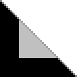
In this situation, instead of having a shape that looks like it’s cut short, it looks like the black triangle sticks out, slightly beyond the light gray triangle.
We can use the same model to find the inaccuracy that makes it look like this. I’ll walk us through the steps again, for one of the pixels on the shared edge.
- The pixel starts off with the background color, white.
- The renderer determines that the black triangle covers half of the pixel.
- The colors mix: the pixel becomes a mix of 50% black and 50% of the previous color, white.
- The renderer determines that the light gray triangle covers half of the pixel. (The same half, really. But we don’t have the information that would let us figure that out in this algorithm.)
- The colors mix: the pixel becomes a mix of 50% light gray and 50% of the previous color. So overall it’s a mix of 50% light gray, 25% black, and 25% white.
Where we wanted the average of 50% white and 50% light gray, we instead got a darker color, as if we scanned a little square that looks like this.

Here too, the workaround follows intuition. If the black triangle seems to stick out, better retract it below the light gray triangle.
Here’s a comparison of the original example (upper) and a safer version (lower) that retracts the black triangle to avoid sticking out. The shapes used are shown on the left, and the combined picture is on the right.

Again, these are embedded as a vector image. See if the black triangle sticks out in the upper version and see if the lower version fixes it.
Avoiding both cases
Let’s say you were fixing the gap between the purple triangle and the gray triangle in this image, enlarged to show the pixels.
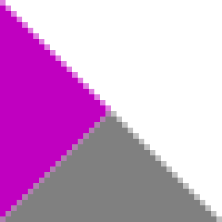
You’d fix this by extending the shape that’s drawn earlier, in this case, the purple triangle. But if you were to extend the edge straight out, going down and to the right, then you’d create another problem, with having edges shared around the overlapping area. Here’s an image of this new problem, enlarged to show the pixels.

So don’t do exactly that. Find a balance between extending/retracting shapes and creating new problems.
Here’s a comparison of the original example (upper), a bad fix that creates another problem (middle), and a safer version (lower). The shapes used are shown on the left, and the combined picture is on the right.

These are embedded as a vector image. See if the original problem and the problem created by a bad fix are visible and see if the safer version avoids both problems.
Axis-aligned edges on integer coordinates
Axis-aligned edges on integer coordinates have a feeling of “this ought to be safe” to them. They ought to fall exactly between pixels, after all. But there are enough exceptions that you might as well take the same precautions. After all, aren’t we all producing vector assets so that people can zoom in without pixelation? Plus, there are even devices with non-integer pixel ratios 😱.
Here’s an example, with a pattern of black and dark gray stripes. There’s a version with many coincident edges (upper) and a safer version without coincident edges (lower).

These are embedded as a vector image. Try viewing it at different zoom levels to see if gaps appear.
Closing words
With all that said, I’m not the one who decides whether you will, from now on, obsess over this stuff.
For one thing, the synthetic examples I created for this use colors chosen specifically to exaggerate the effect. You can probably get away with a lot in other cases.
In fact, in GitLab’s fixed logo, some of the overlap they added goes farther than it probably should. The orange shapes (Oh yeah, like that narrows it down. I mean the medium orange ones under the ears.) come really close to the outside of the logo and end up getting blended with the light orange triangles. You can see the extra orange if you render the logo on a background that’s the same light orange color as the outermost triangles.

But they don’t set their logo on a light orange background. They set it on colors like white or purple, and you’d never notice.

Which is to say that you spent around ten minutes reading about a cosmetic issue, that’s literally tiny, is caused by a specific implementation detail on certain renderers, that might change later on, and is less visible on newer high-DPI displays. Now that’s a level of dedication to the art that I like to see.
Addendum: It turns out that it’s not just you and I who worry about this. A question from the Graphic Design Stack Exchange discussed this behavior with hundreds of participants caring enough to vote it as useful.
My last post was about either List of shapes commonly referred to as squares or The essence of anticipation (2016). Find out which.